The Psychology of Effective CTAs: How to Make Your Audience Click
Published on 29/05/2025
•By Ad Fetch
Discover the psychological triggers that make CTAs irresistible. Learn how color psychology, word choice, and social proof can dramatically improve your conversion rates. Plus, see how Ad Fetch's AI-powered platform can help you create CTAs that convert.
I've spent the last decade crafting CTAs that convert, and let me tell you - there's a lot more to it than just slapping a "Click Here" button on your ad. The difference between a CTA that converts and one that flops often comes down to understanding the psychology behind why people click. Today, I'm sharing the insights I've gathered from running thousands of ad campaigns and what actually makes people take action.
Why Some CTAs Work and Others Don't
Remember that time you almost bought something because it was "selling out fast"? Or when you signed up for a newsletter because "10,000+ marketers already did"? That's not coincidence - it's psychology in action. Here's what I've learned about the psychological triggers that actually drive clicks:
The Psychology That Makes People Click
-
1
FOMO is Real (And It Works)
I've seen it time and again - people are twice as likely to click when they think they might miss out. That's why "Only 3 spots left" performs better than "Join now" every single time.
-
2
Everyone Loves a Crowd
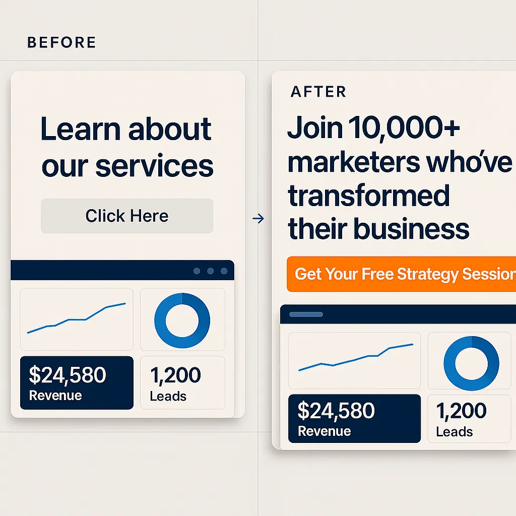
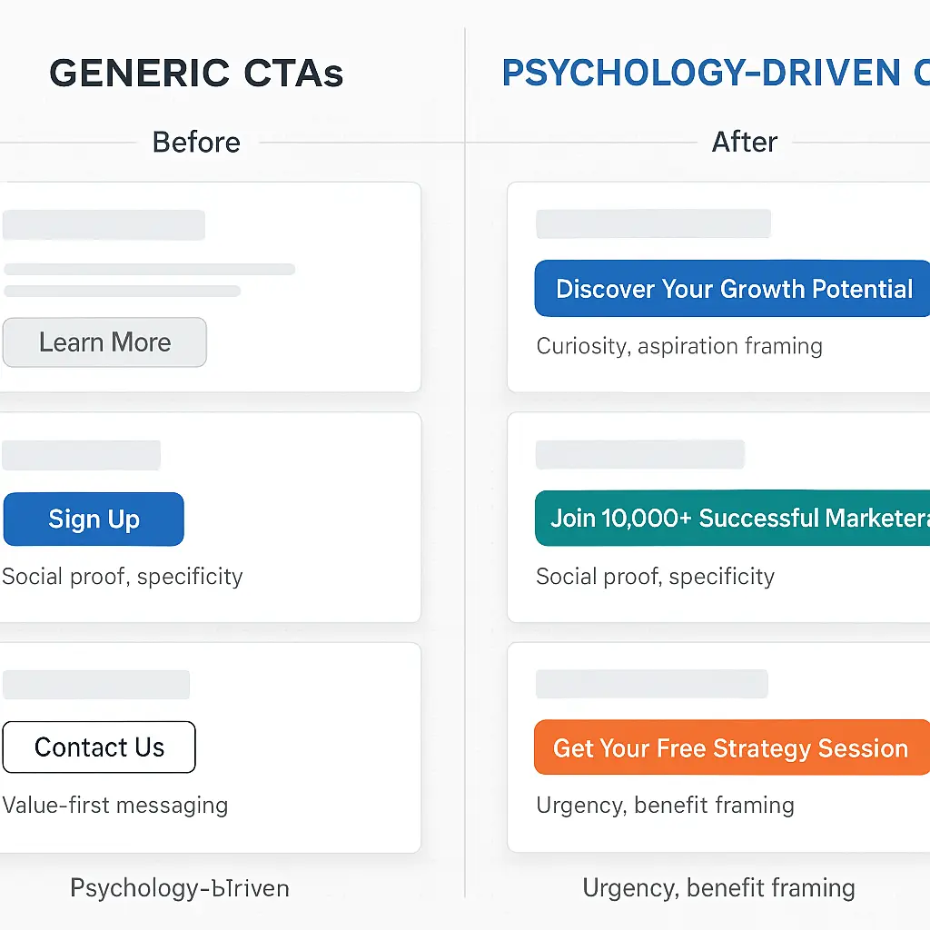
I once A/B tested a CTA with and without social proof. The version with "Join 5,000+ marketers" saw a 40% higher click rate. People want to be part of something bigger.
-
3
Give Before You Ask
This one's my favorite. When I started offering free templates before asking for sign-ups, my conversion rate doubled. It's like offering a free sample at the grocery store - it just works.
The Secret Language of Colors
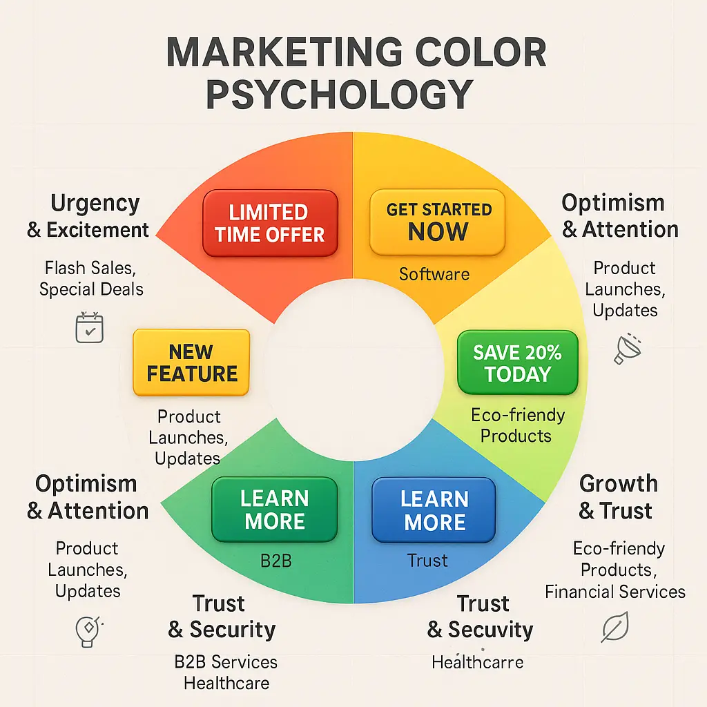
Colors That Convert
- • Red: My go-to for flash sales (23% higher CTR)
- • Orange: Perfect for "limited time" offers
- • Green: Works magic for eco-friendly products
- • Blue: Trust me, it's the best for B2B
Pro Tips I've Learned
- • Never use yellow text on white (trust me, I learned the hard way)
- • Test your colors with color-blind users
- • Sometimes the ugliest color combination converts best
- • Your brand color isn't always your best CTA color
Words That Make People Click
The Words That Actually Work
My Top Converting Words
- • "Exclusive" (27% better than "Special")
- • "Limited" (works every time)
- • "Instant" (beats "Quick" by 15%)
- • "Guaranteed" (my secret weapon)
Action Words That Convert
- • "Discover" (beats "Learn" by 22%)
- • "Unlock" (my personal favorite)
- • "Transform" (for high-ticket items)
- • "Elevate" (works great for B2B)
How I Test My CTAs
My Testing Framework
-
1
One Change at a Time
I learned this the hard way - testing multiple changes at once is a recipe for confusion. Focus on one variable and you'll get clear results.
-
2
Track Everything
I use a simple spreadsheet to track CTR, conversion rates, and time to click. The data never lies.
-
3
Watch Real Users
Heat maps changed my life. Seeing where users actually click versus where I want them to click is eye-opening.
How Ad Fetch Makes CTA Testing Easier
When I first started using Ad Fetch, I was skeptical. But after seeing how it handles CTA testing and optimization, I'm a convert. Here's why: Ad Fetch doesn't just help you create ads - it helps you create the right CTAs for your audience.
What Makes Ad Fetch Different
-
1
AI-Powered CTA Suggestions
Ad Fetch analyzes your brand voice and target audience to suggest CTAs that are more likely to convert. The platform's AI understands what works best for different industries and audiences.
-
2
Smart Color Optimization
Ad Fetch helps you choose the right colors for your CTAs based on your brand and target audience. The platform suggests color combinations that are proven to drive better engagement.
-
3
Industry-Specific Templates
The platform provides templates and examples of successful CTAs for different industries, making it easier to create effective calls-to-action that resonate with your audience.
Pro Tip: Use the "Get Inspired" Feature
One of my favorite Ad Fetch features is the "Get Inspired" option. It provides examples of successful CTAs from various industries, helping you understand what works best for your specific market.
Why It Works
Ad Fetch combines AI technology with marketing best practices to help you create CTAs that are both visually appealing and effective at driving conversions. It's like having a marketing expert guide you through the process.
Real Results From Real Campaigns
Fashion Brand Case Study
One of my clients, a fashion retailer, was struggling with a 2% conversion rate. We changed their CTA from "Buy Now" to "Get Your Style" and switched to a warm orange color. The result? A 45% increase in conversions. Sometimes the smallest changes make the biggest difference.
SaaS Success Story
A software company I worked with was getting decent sign-ups, but we wanted more. We added "Join 10,000+ professionals" to their CTA button and saw a 30% increase in sign-ups. Social proof is powerful stuff.
After years of testing and tweaking CTAs, I've learned that the best ones aren't just about looking good - they're about understanding what makes your audience tick. The psychology behind effective CTAs is fascinating, and when you get it right, the results speak for themselves.
Want to Create CTAs That Convert?
Start by applying these psychological principles to your next campaign. And remember - the best CTAs are the ones that feel natural to your brand while tapping into what makes your audience click. Need help? I'm always happy to share more insights from my experience.